Ecosexual
About
project
Ecosexual is a Ukrainian eco cosmetic brand. The main challenge was low conversion: many users browsed the website but dropped off before reaching the cart. The goal was to redesign the homepage and product browsing experience to increase clarity and trust.
Collaboration: Group academic project
Year: 2025
Role: UX Designer
Location: Ukraine

Responsibilities
My responsibility was to analyse the existing Ecosexual website, identify why users were dropping off before completing a purchase, and redesign the experience to make it clearer, simpler, and more intuitive. I started with a full UX audit, explored the limitations of the Shop Express platform, and focused on improving the structure, navigation, and product presentation. My work included redefining the homepage messaging, rebuilding the navigation for better visibility, redesigning product cards, enhancing visual consistency, and ensuring the overall shopping flow felt smooth and effortless for users.
Challenges
One of the biggest challenges was that users frequently abandoned the process before reaching the checkout. The original site also suffered from unclear communication: the main message “naked cosmetics” didn’t fully explain what the brand offered, and the hidden burger menu on desktop made navigation harder than it should be. Product cards lacked clarity and required extra clicks, the visuals were inconsistent, and some key features were missing due to platform restrictions.
UX Research
& Insights
To better understand the user behaviour, I conducted usability testing with several participants and observed how they interacted with the original website. Many struggled to immediately understand what the brand was about and felt uncertain about where to go next. Several users also noted that long texts slowed them down, and the lack of filters (hair type, product type) made browsing more difficult.
User Persona
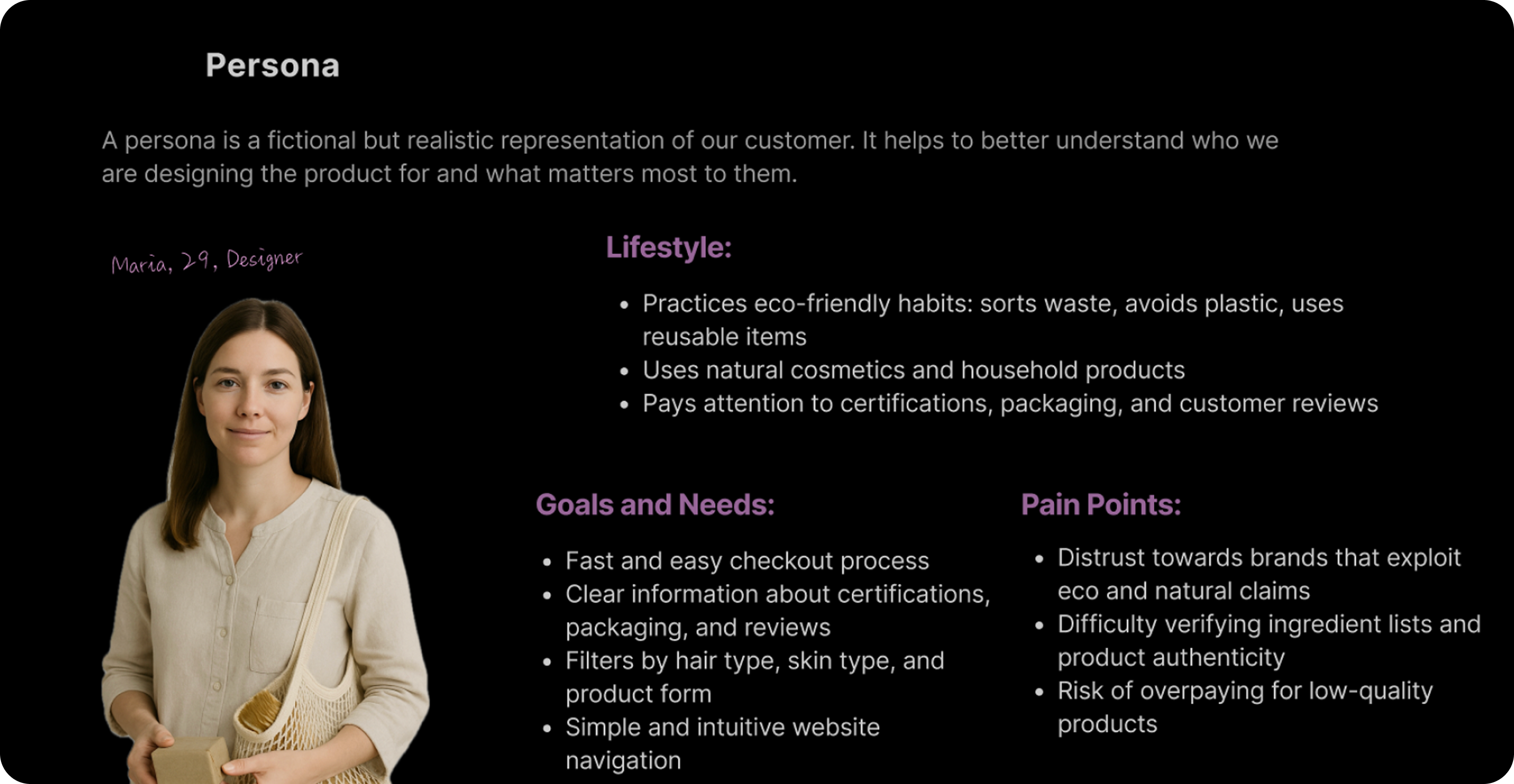
Maria is a typical customer of the brand, she cares about sustainability and wants a simple, clear website where she can quickly find what she needs and feel confident the products are truly high-quality.
Empathy Map
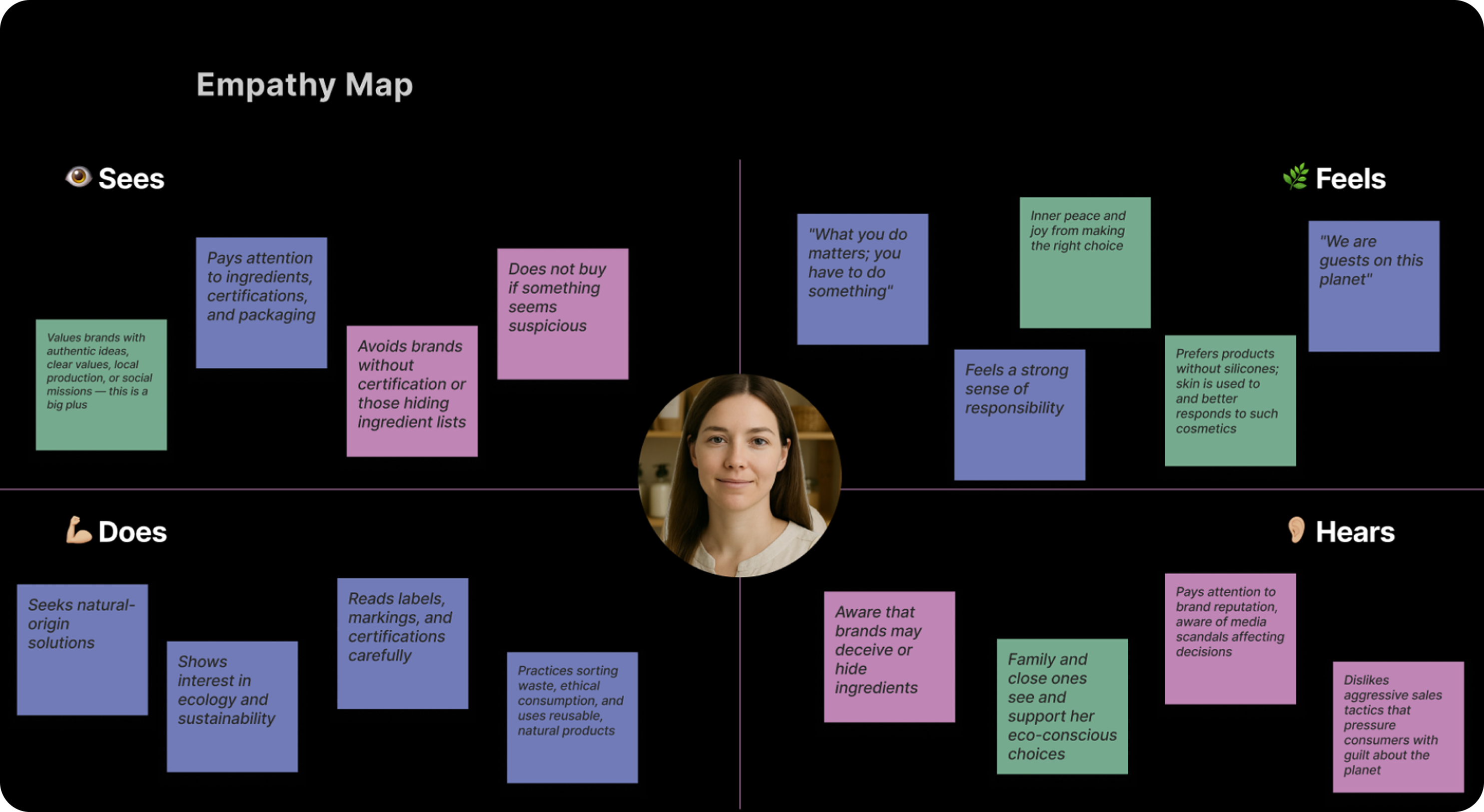
The empathy map helped me to understand better the user what she cares about, what she worries about, and how she makes decisions. It showed where the website felt confusing or untrustworthy for her, and helped me see what needed to be clearer and easier.
Final Design (UI)
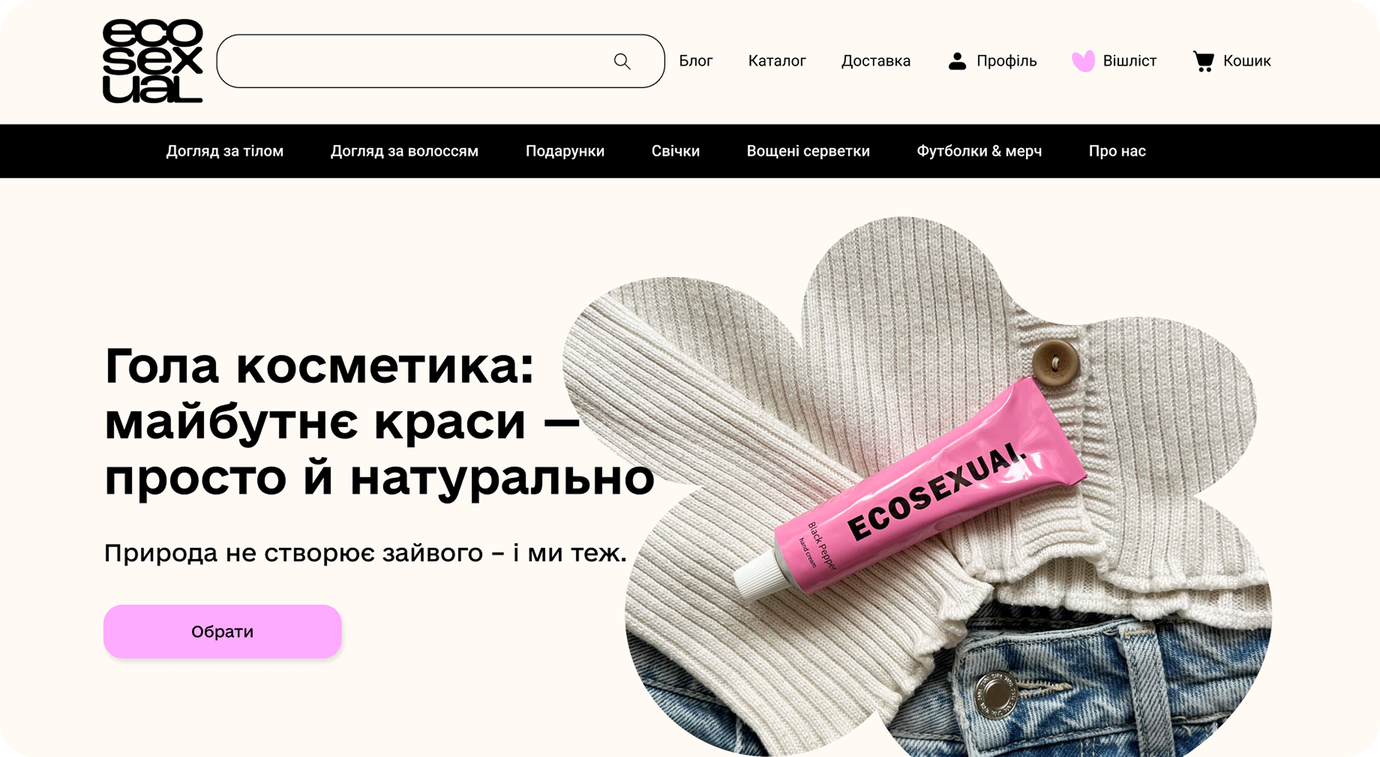
Before
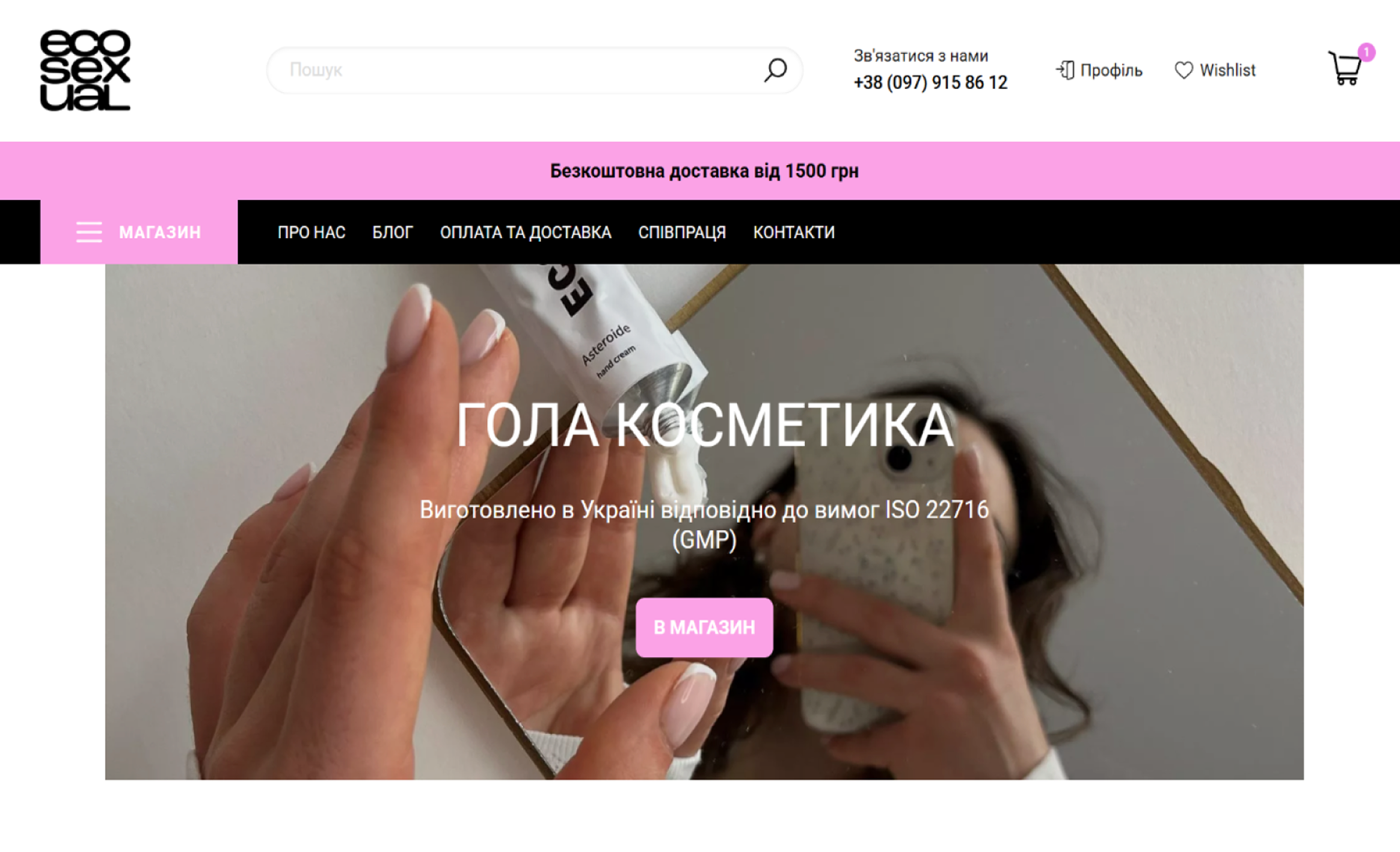
The hero section was confusing and didn’t clearly show what the brand offers. The burger menu on desktop felt strange, and the headline “Naked cosmetics” was not clear from the first look.
After
Now the navigation is open and easy to see, and the headline is more understandable. The idea of the brand becomes clear in the first seconds. The whole section looks simpler and easier to read.
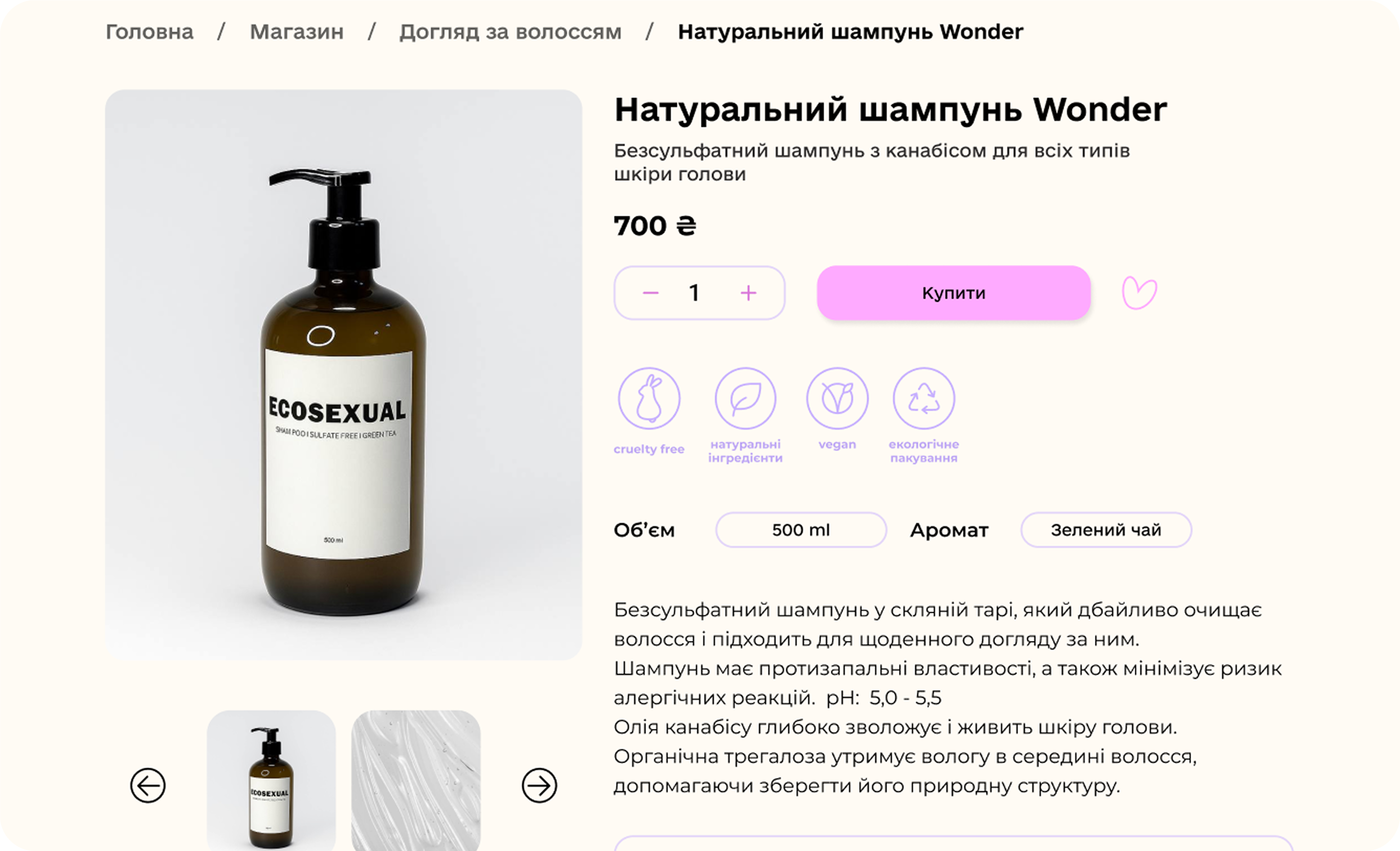
Before
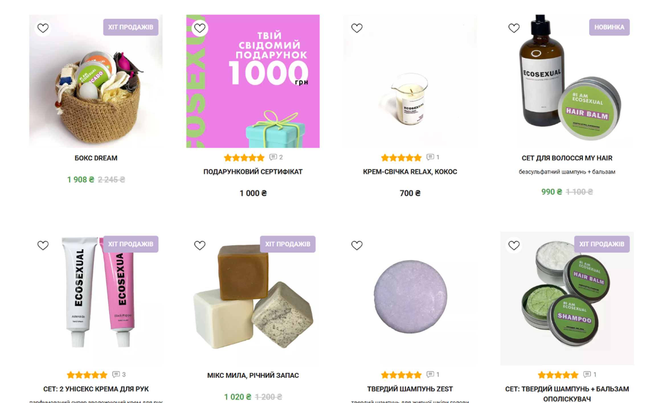
Product cards didn't show enough information and had no “Add to cart” button. People had to make extra steps and often felt confused because the photos looked different from each other.
After
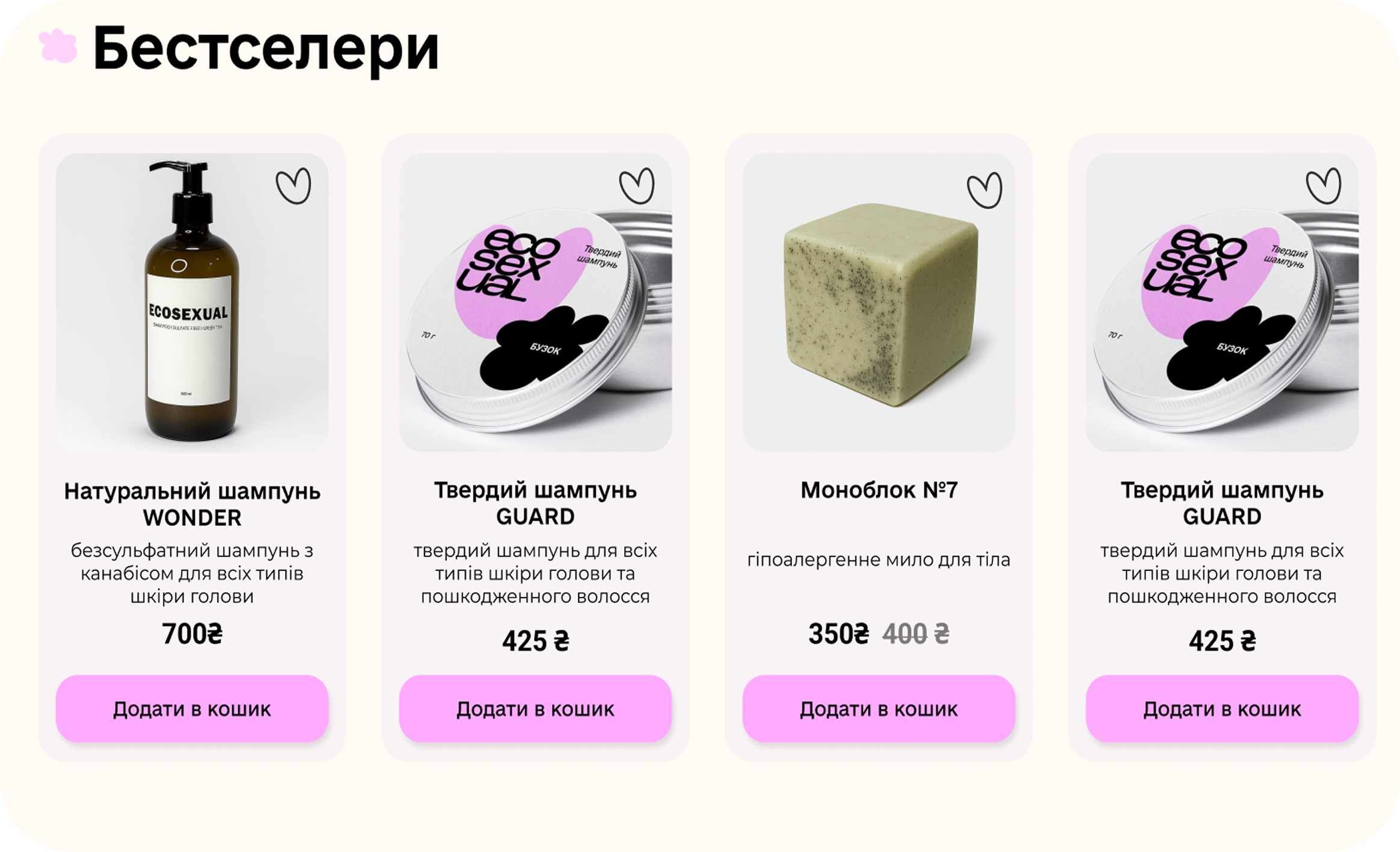
Now the cards have clear descriptions, prices, and an “Add to cart” button. The photos look consistent and simple, so it’s easier for users to make a choice.
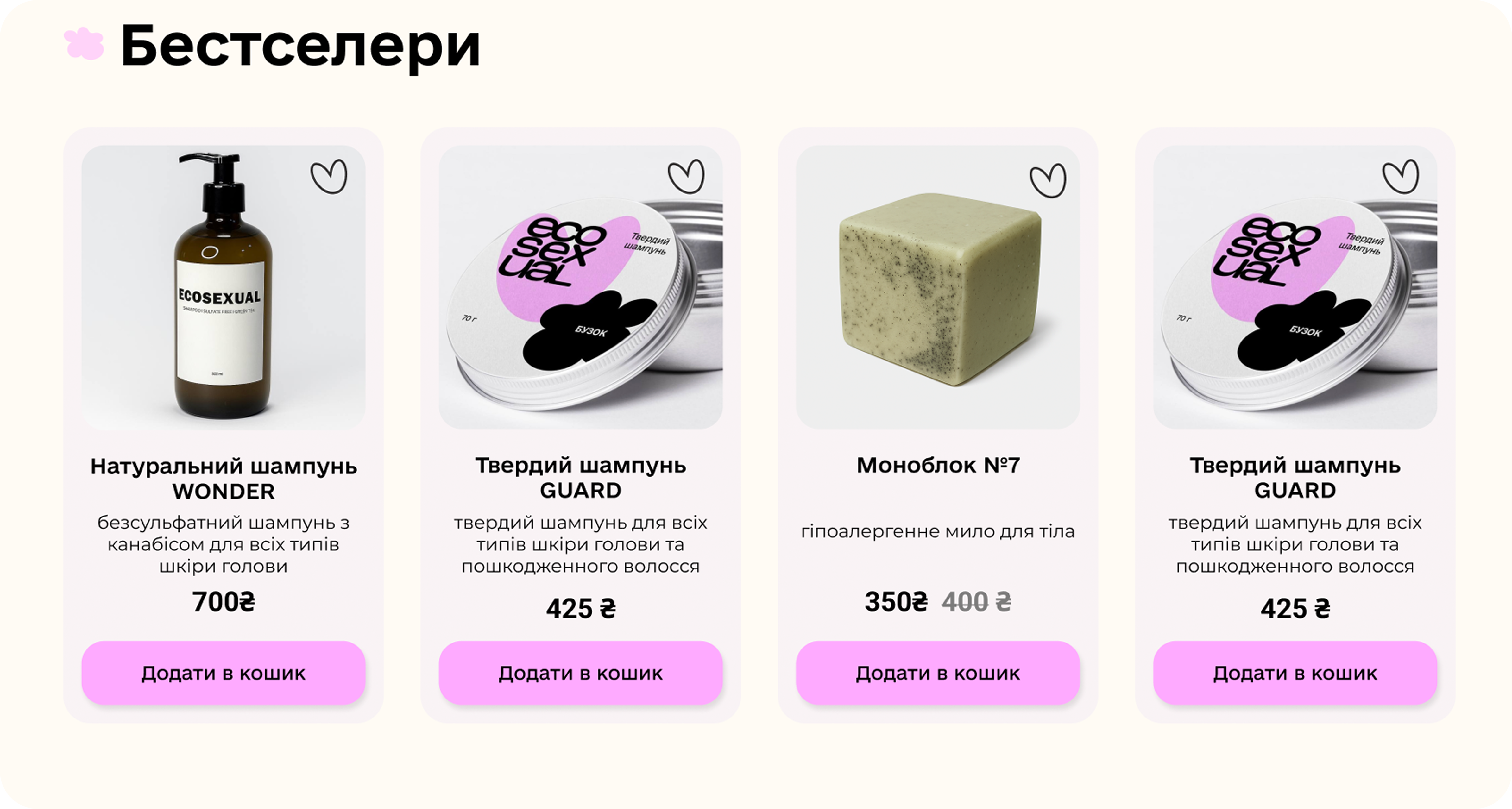
Before
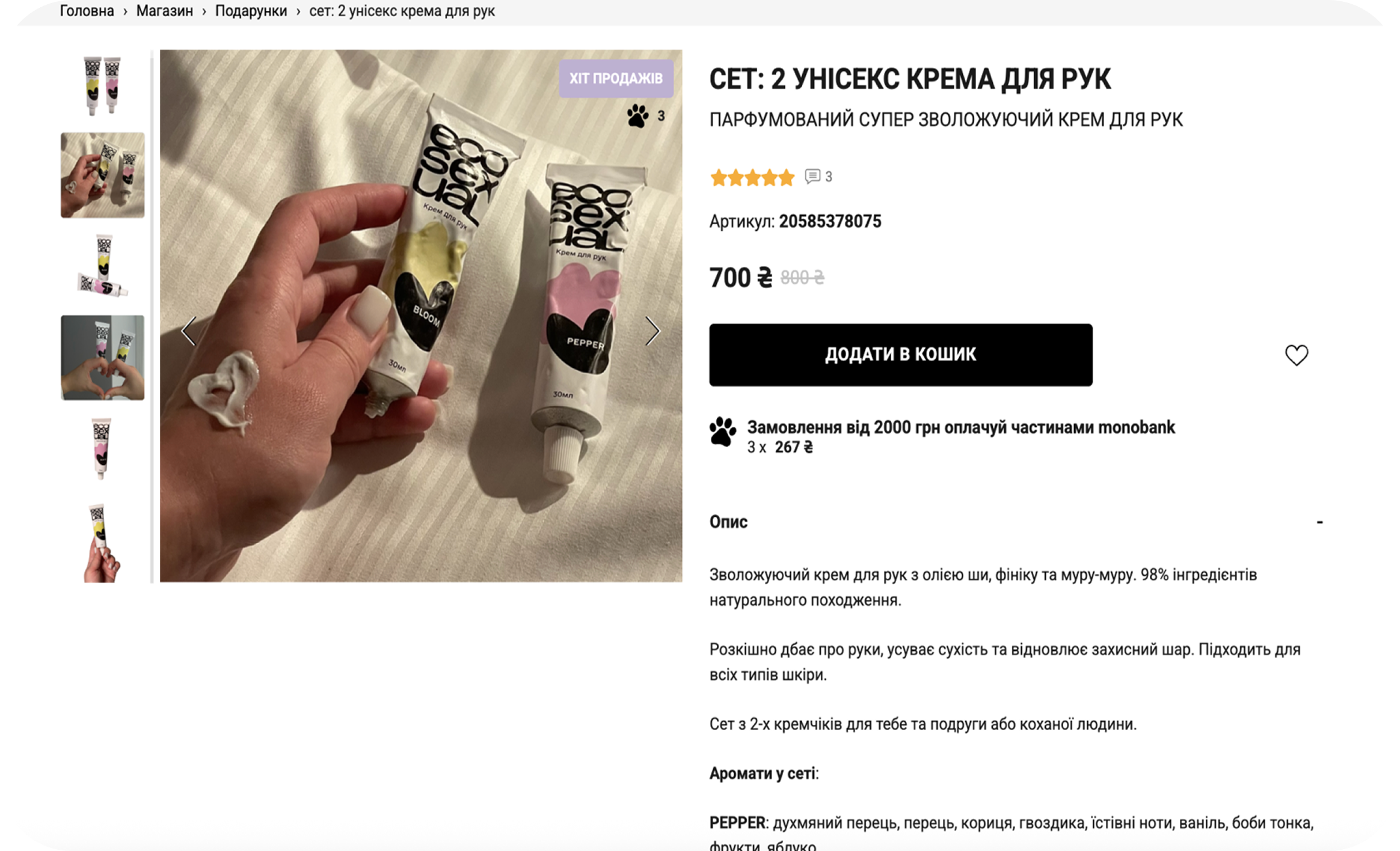
The page felt overloaded, the text looked messy, the navigation was hard to follow, and the hover effects covered important information.
After
Now the content is simpler and clearer, and the image gallery works in a more comfortable and predictable way.
Before
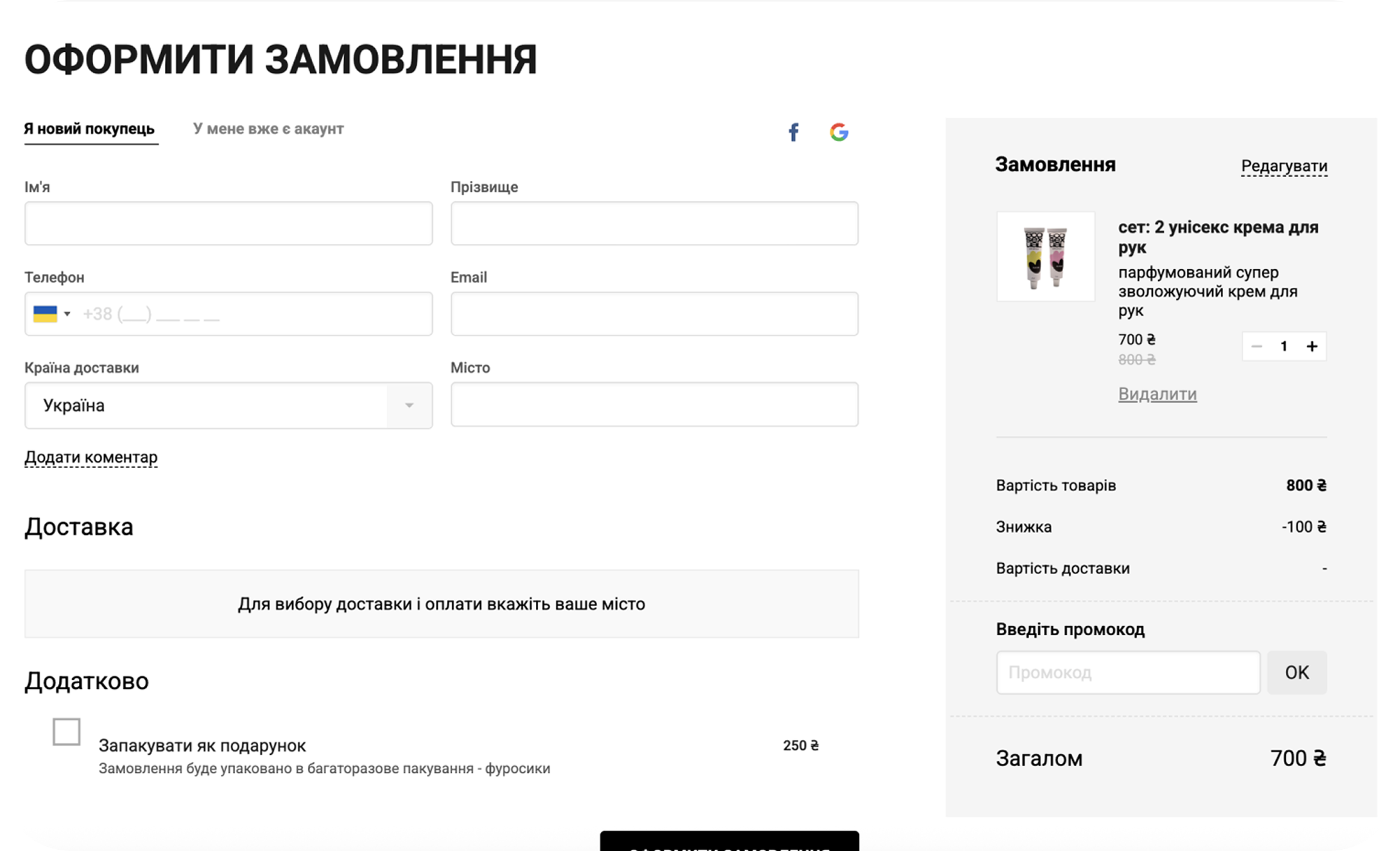
The checkout had repeated elements, unclear options, and a weak structure, so users often got stuck or slowed down.
After
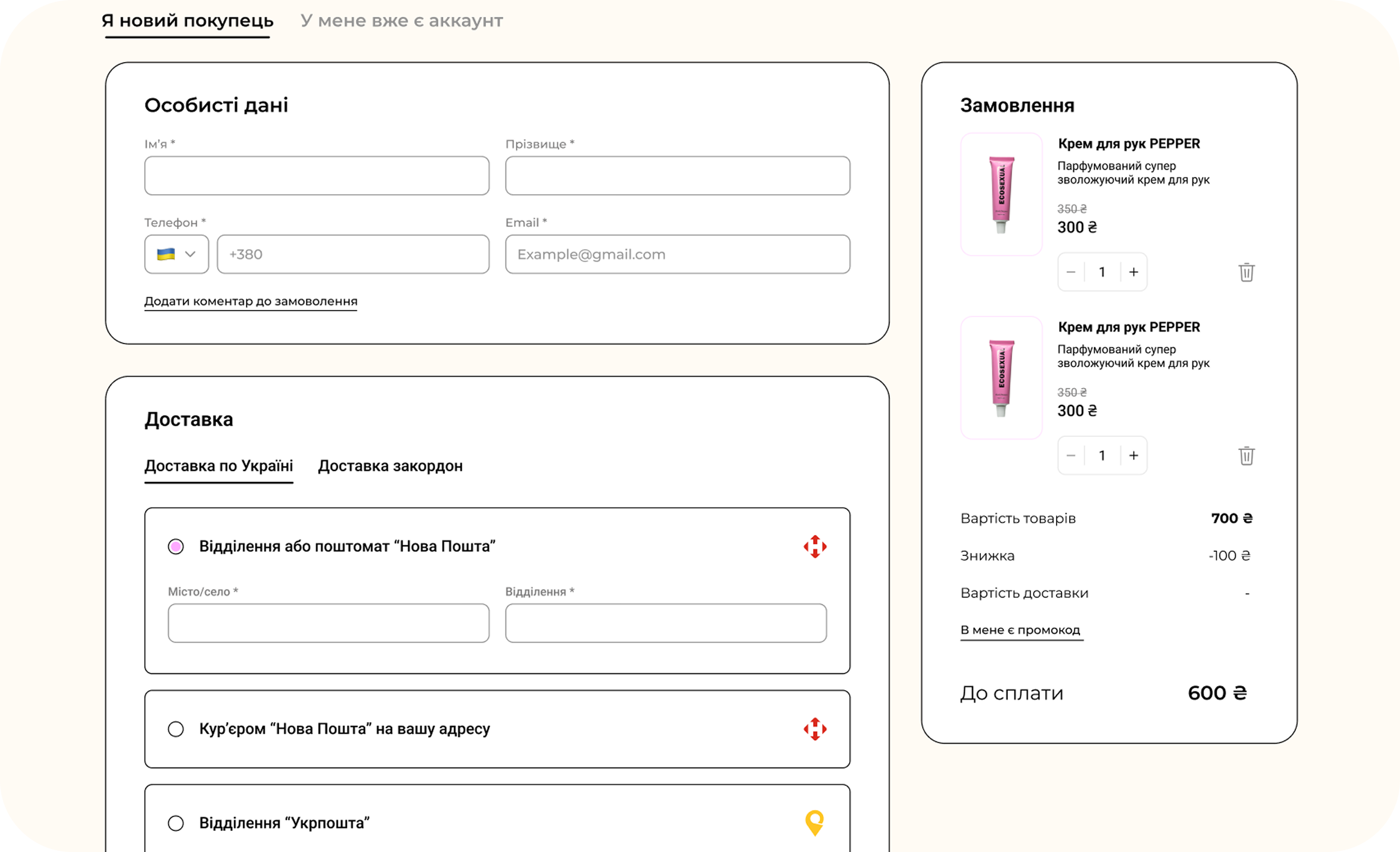
The layout now has clear blocks, the options make more sense, and updating the order is easier. The whole checkout flow feels faster and more intuitive.