Babusyna Khatka
About
project
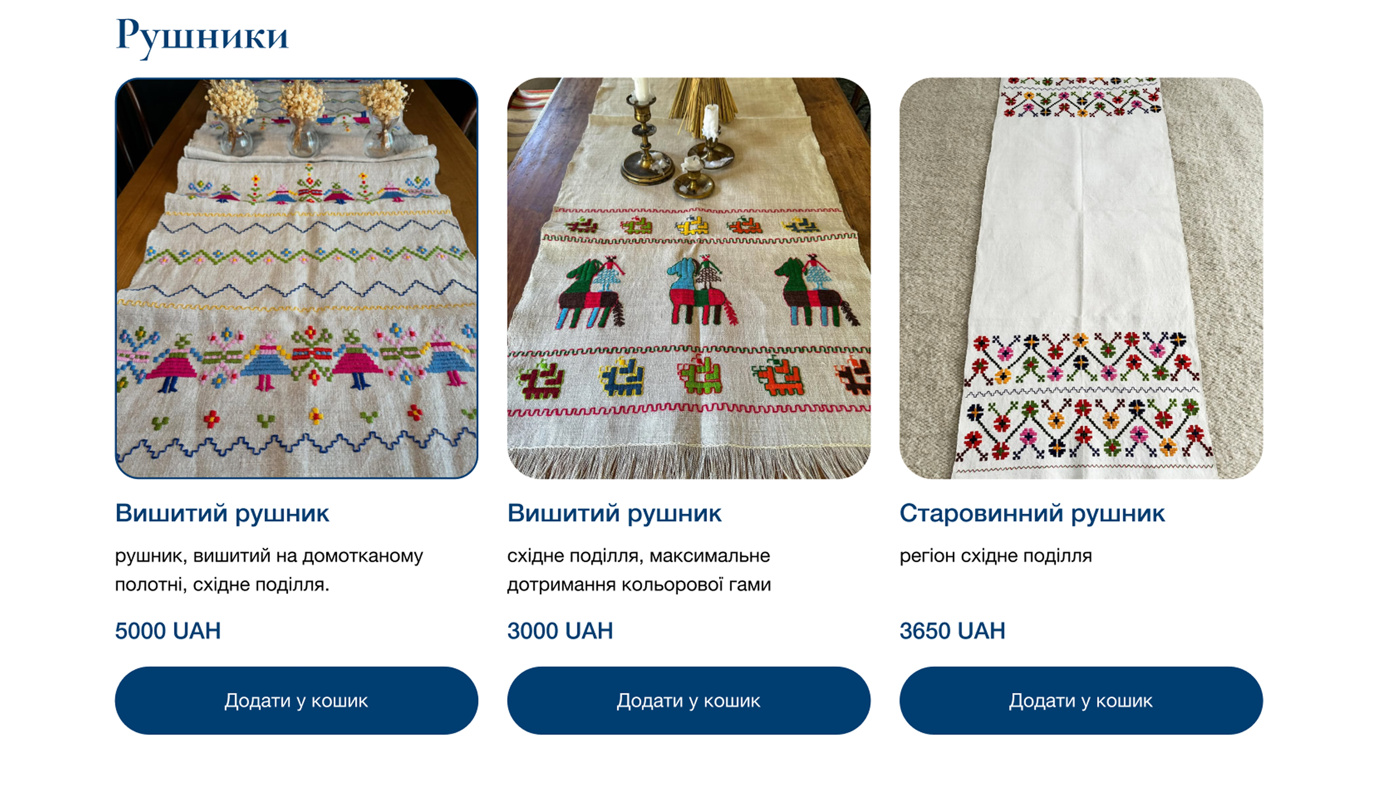
Babusyna Khatka is a cultural project blending tradition with digital storytelling. Through thoughtful design and user-friendly navigation, the website immerses visitors in the charm of Ukrainian rural heritage, offering cottage rentals, workshops, and cultural experiences.
Client: Anna Suchobrus
Year: 2025
Role: UX/UI Designer
Location: Ukraine

Responsibilities
My main responsibility was to create a website for a business that previously had no online presence. I handled the full design process: researching the brand, defining the structure, creating the sitemap, wireframes, mood board, and finally designing the full UI. I focused on building a website that felt intuitive, easy to use, and visually connected to Ukrainian cultural heritage. I also ensured the design was fully responsive so users could move smoothly across all devices.
Challenges
The main challenge was starting from zero, the business didn’t have a website, visual system, or digital structure. I needed to understand the brand deeply and translate its cultural identity into a modern digital experience. The main goal was to build a website that reflected Ukrainian rural culture while still keeping the interface clean, simple, and user-friendly.
UX Research
& Insights
I began by researching the business, its services, and its audience to understand who the users were and what they expected. A sitemap allowed me to organize the content logically, making it easy for users to move across pages. Wireframes helped validate the layout before making final design.
Information
Architecture
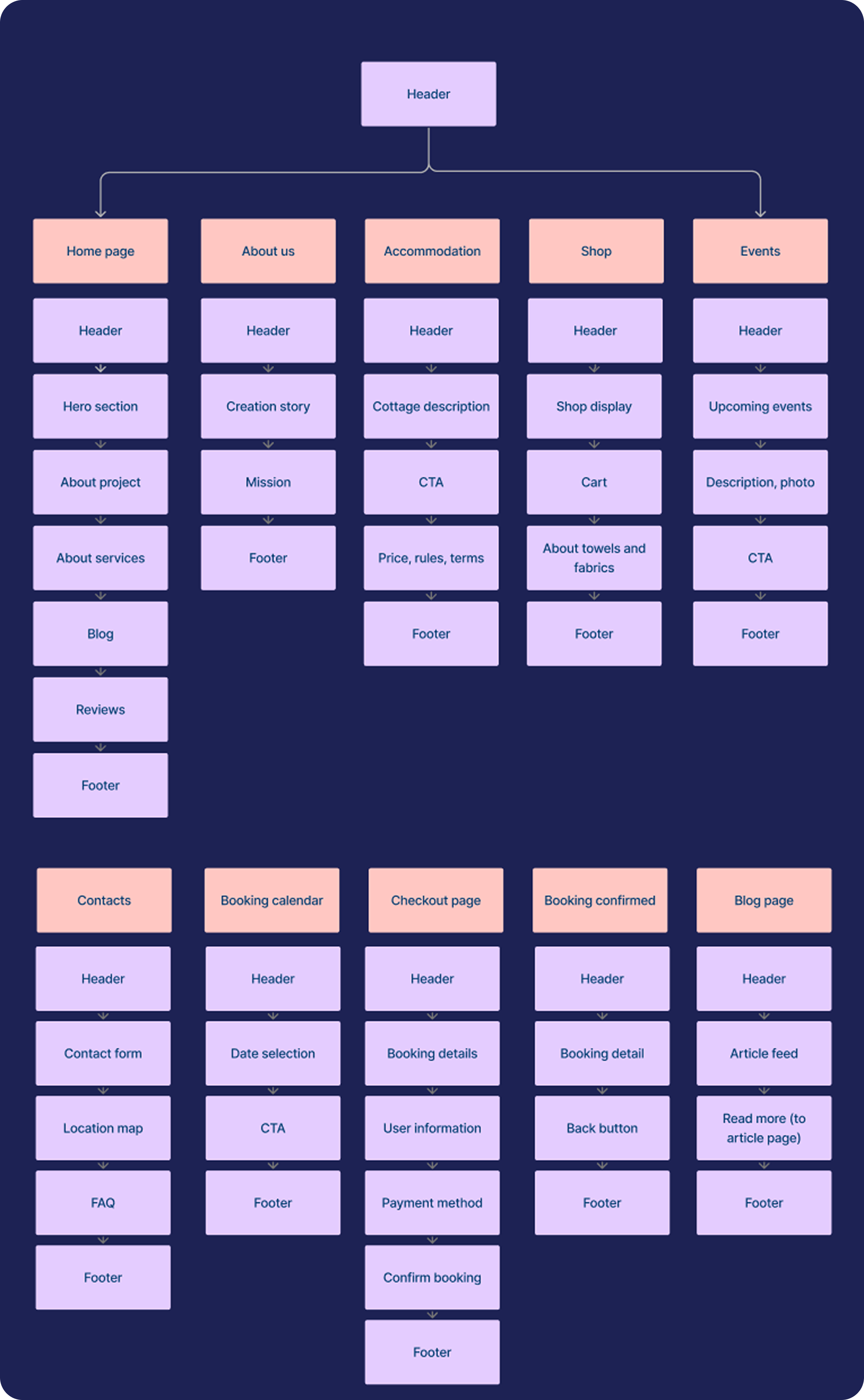
The information architecture helped me structure the website in a clear and logical way. I organised all pages into intuitive sections so users can easily understand where they are and find what they need. This structure also made the design process smoother and ensured the website feels simple and predictable for visitors.
User Flow
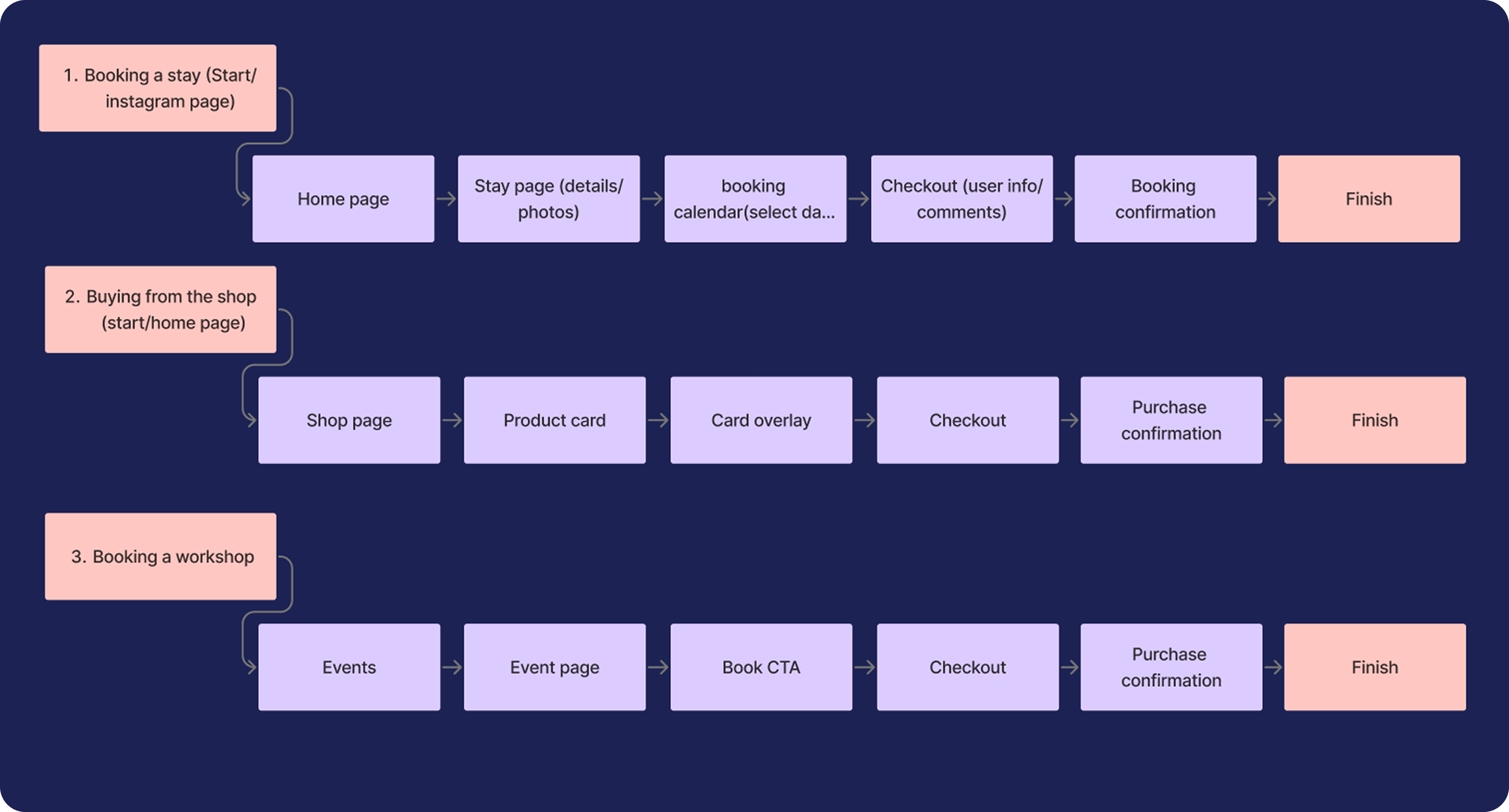
The user flows show how people move through the website to complete key tasks, to book a stay, to buy a product, or to reserve a workshop. These steps helped me to remove unnecessary actions and create a smoother, more intuitive experience, so users reach their goal quickly and without confusion.
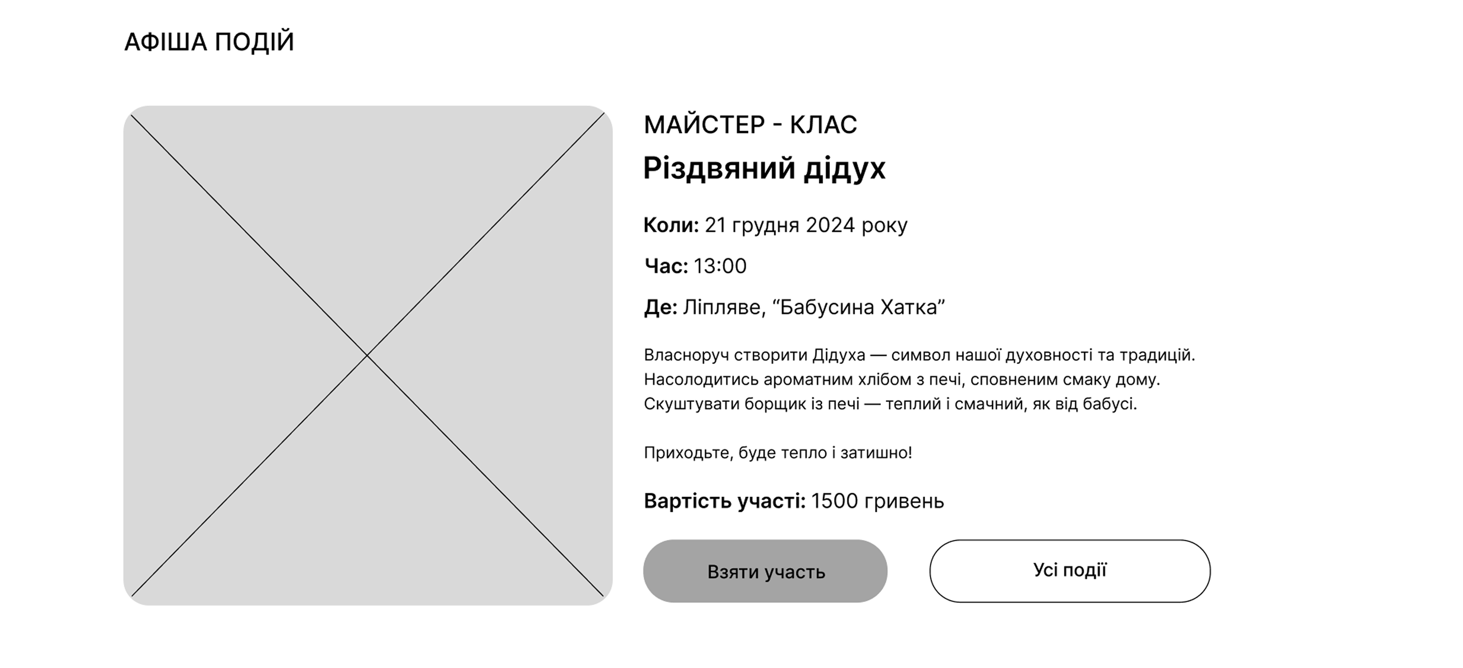
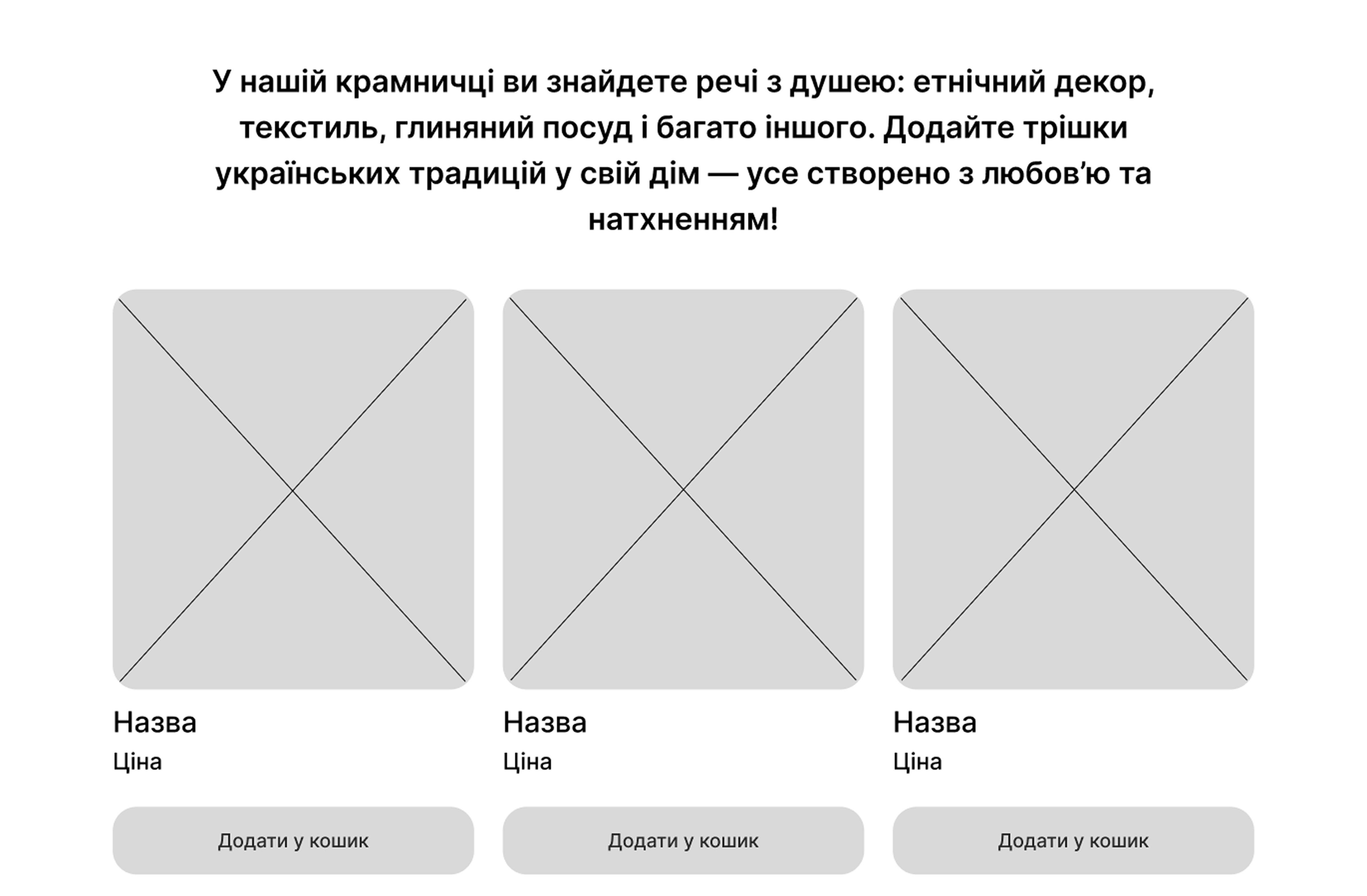
Wireframes
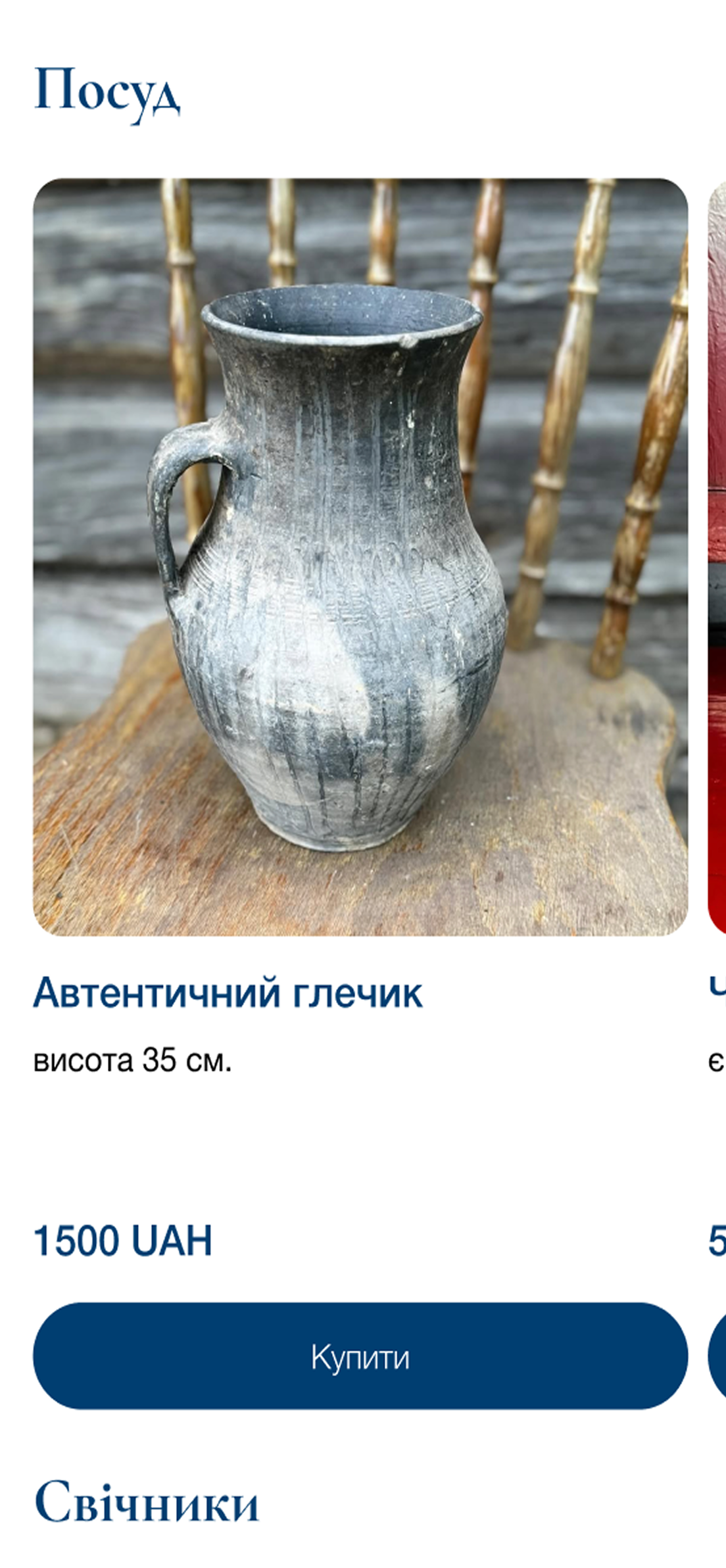
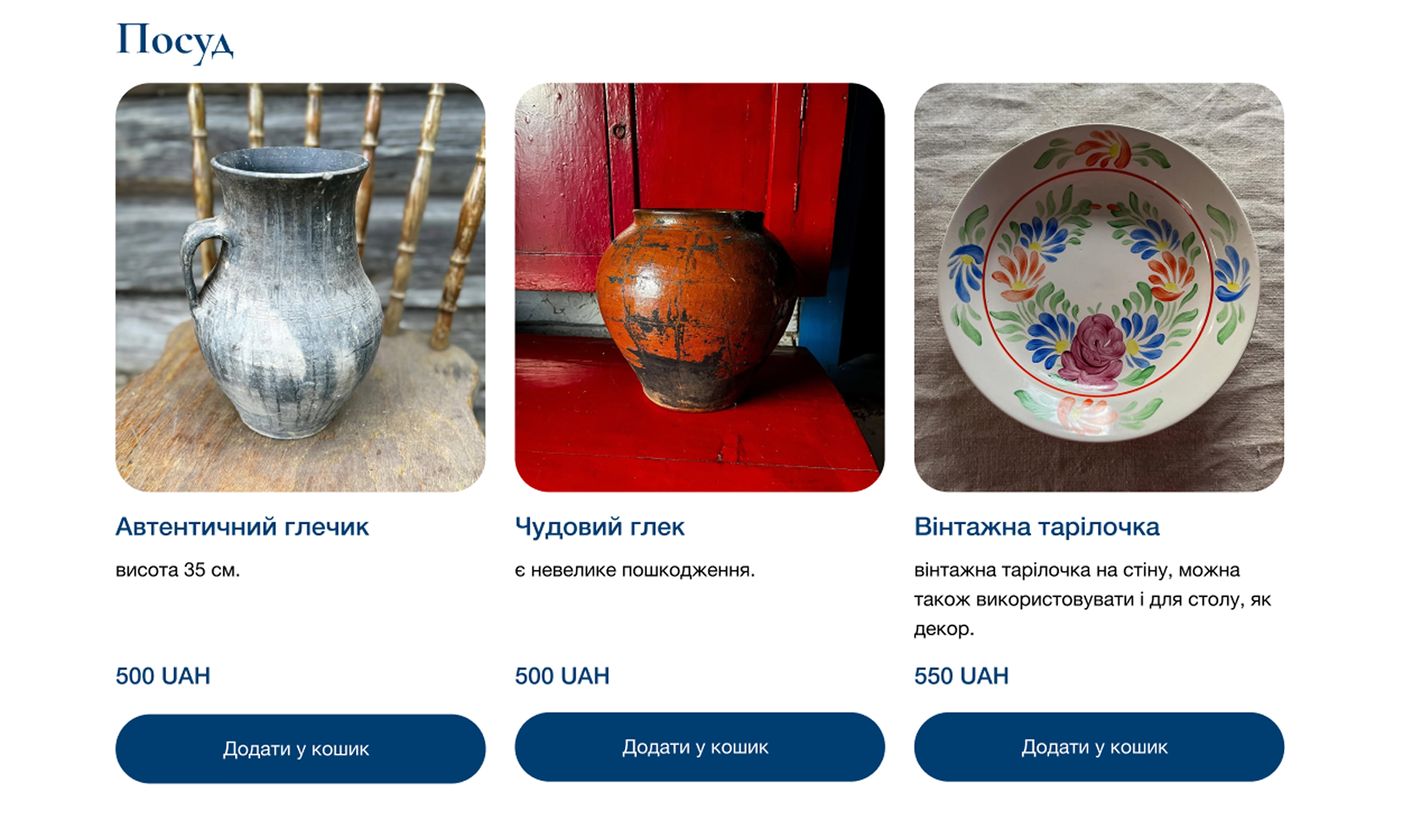
Final Design (UI)
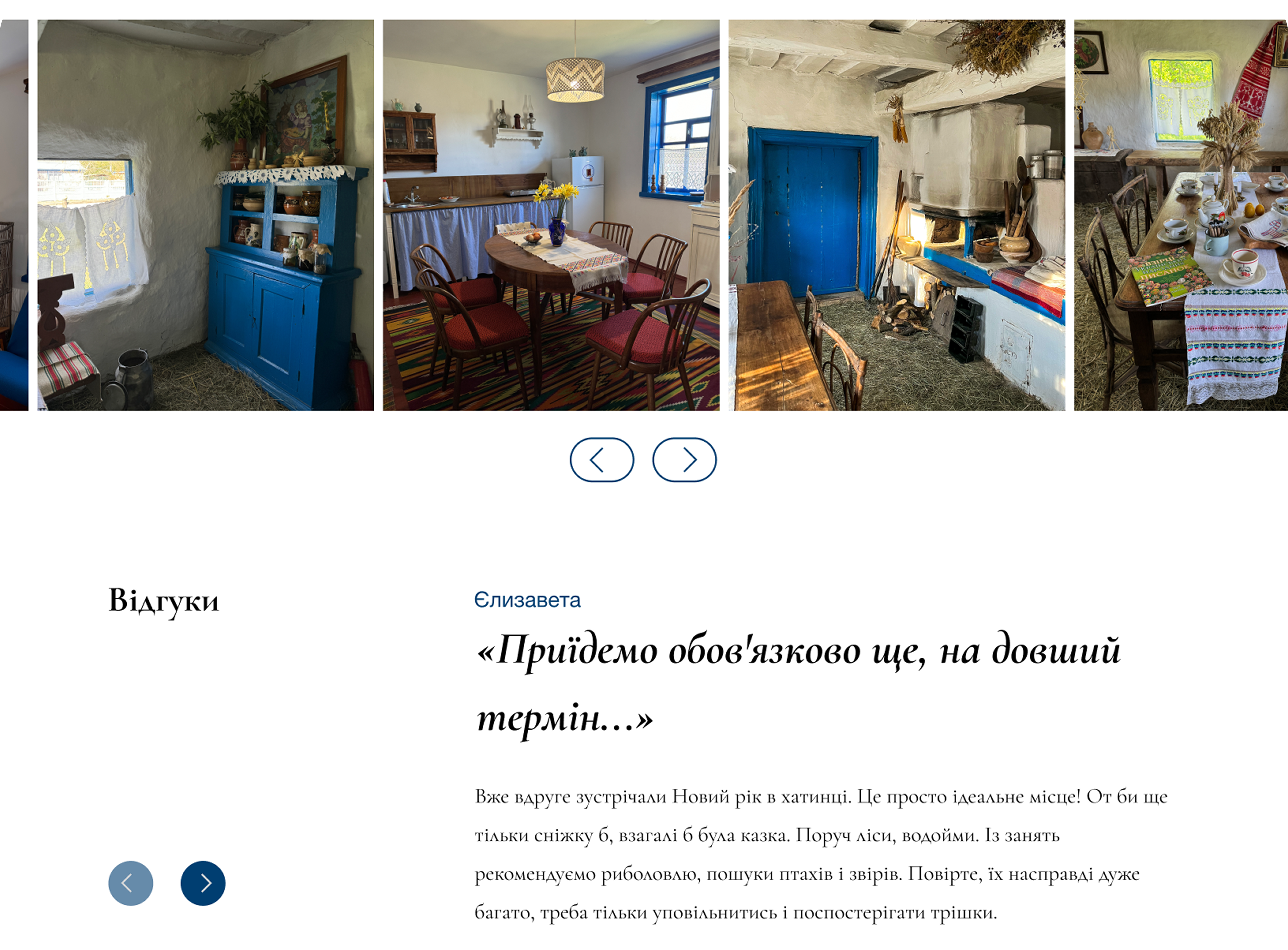
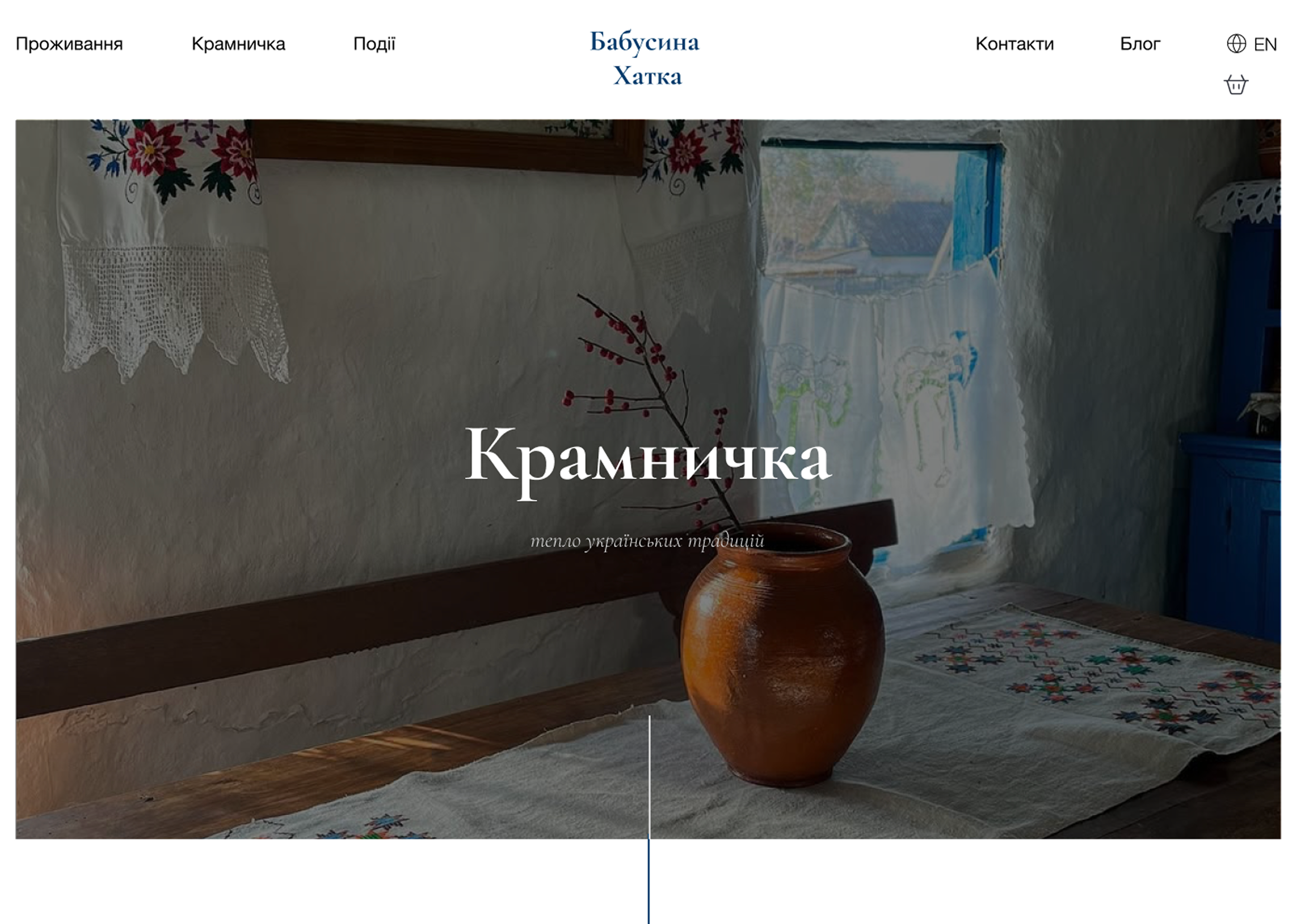
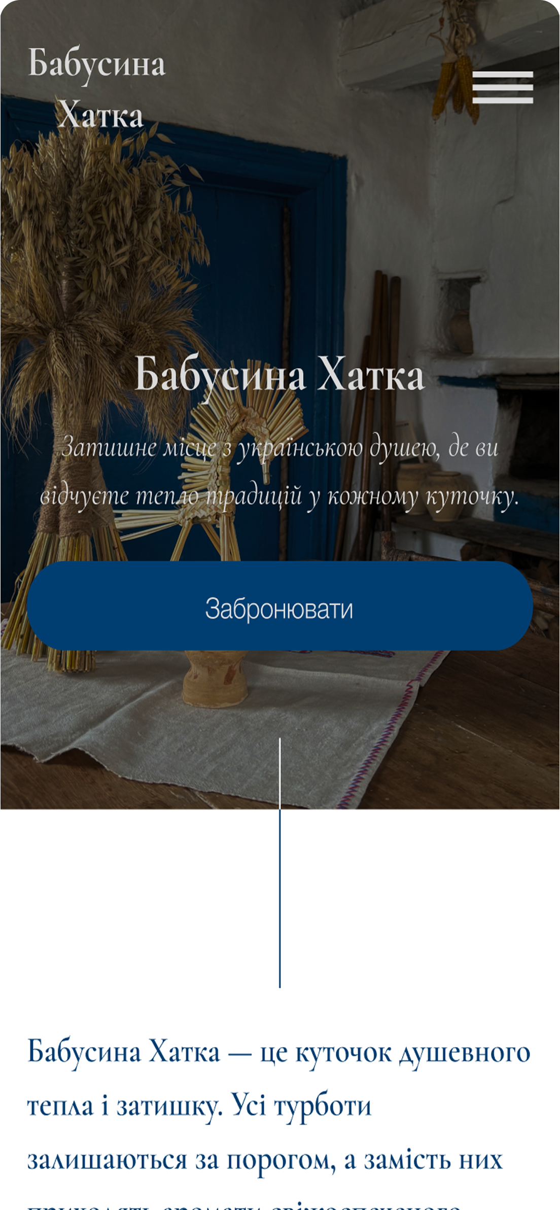
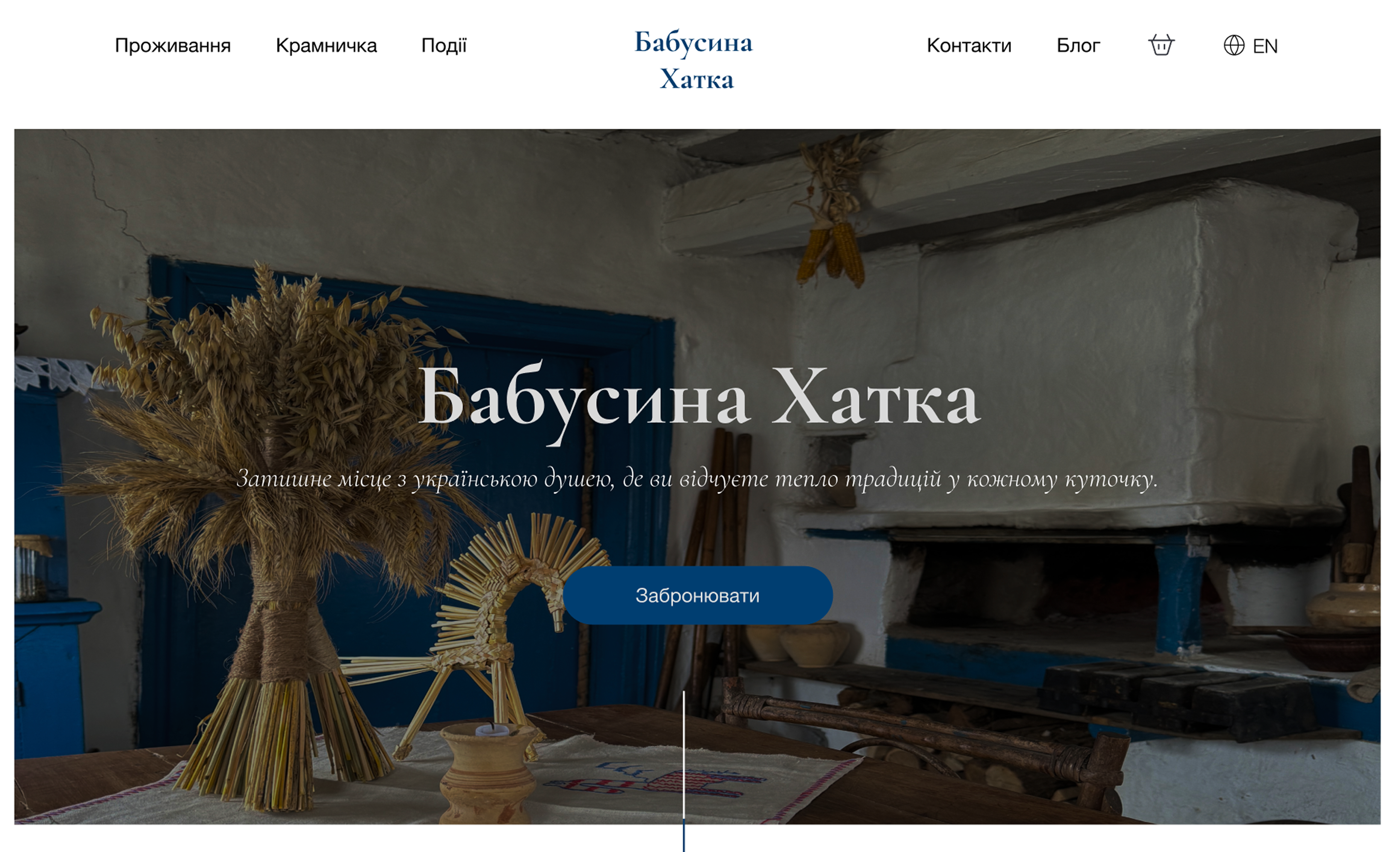
The blue color was chosen based on the client’s request. Her brand identity is strongly tied to blue, but she didn't yet have a defined shade, so my task was to find a tone that looked authentic, calm, and connected to Ukrainian rural aesthetics. The final shade supports the atmosphere of the cottage and feels natural within this cultural context.
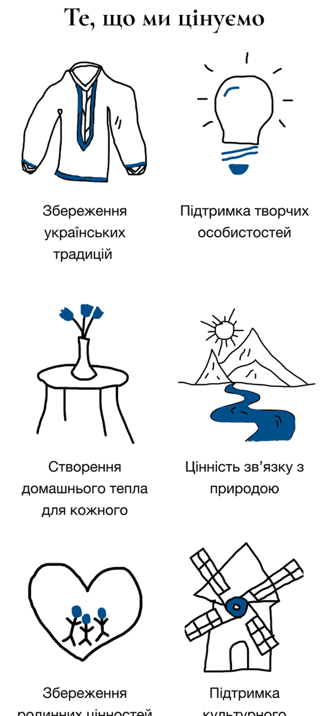
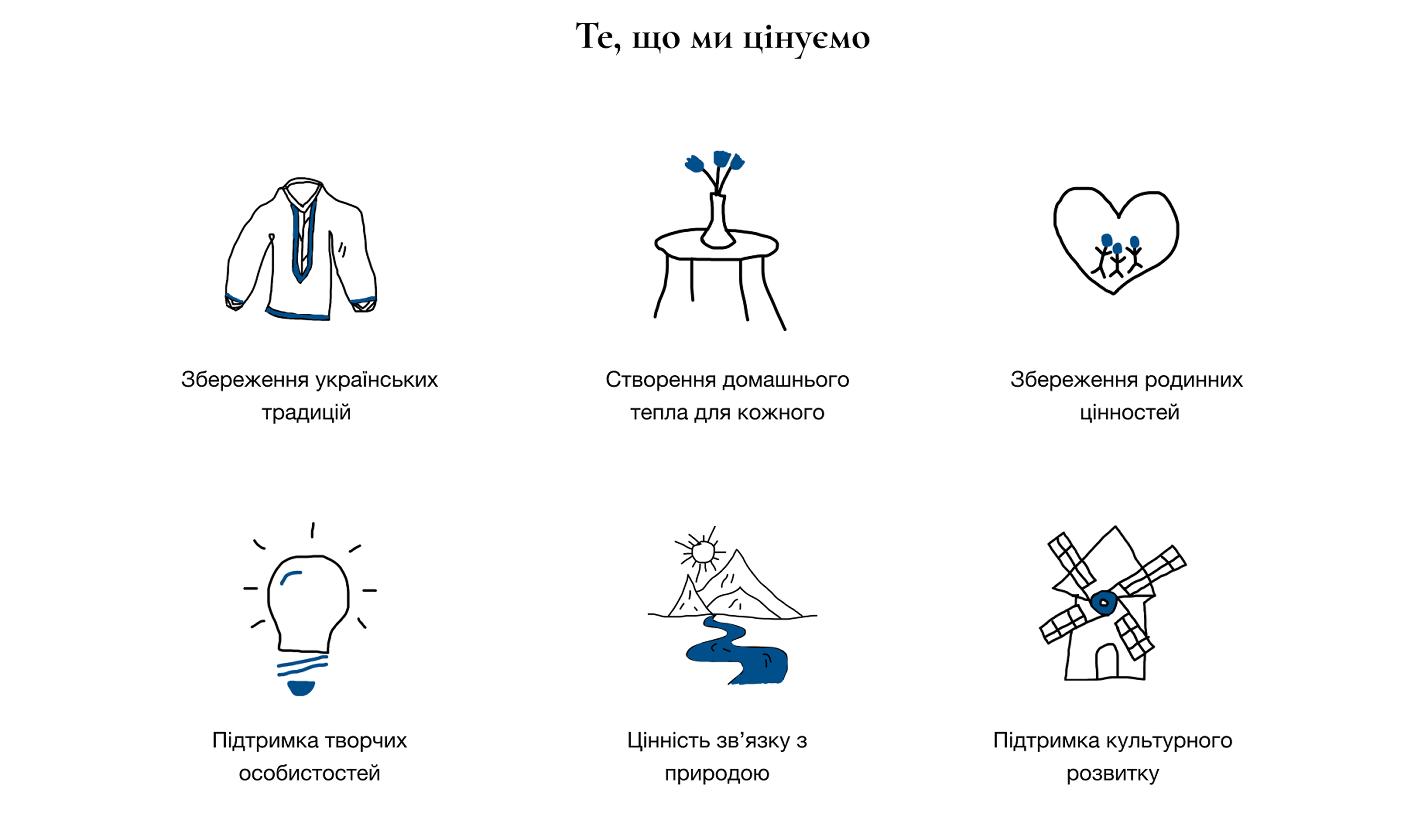
For typography, I combined classic font with italic accents. This mix adds a sense of heritage and warmth while still keeping the website modern and readable. The hand-drawn icons were introduced to bring a more personal, human touch to the page. The small blue accents help to connect them visually to the main brand color. These illustrations make the “What we value” section feel friendlier and more engaging, helping users connect emotionally with the project.